The website uses cookies for statistical, advertising and functional purposes. Read more
I accept
more

Display for Series XT5 – Braun

1
2
7
0
0
4
2
0
%

Display for Series XT5 – Braun

1
2
7
0
0
4
2
0
%
Display for Series XT5 – Braun
Client
Procter & Gamble
Destination
retail chains in Poland
Dimensions
15 x 14,5 x 21cm
Materials
black satin Plexiglas, magnetic mat, lenticular designs
Technology
Plexiglas bending, plastic bonding
Task
Braun XT5200 is an innovative trimmer offering easy, fast and comfortable shaving. read more
We wanted to additionally highlight the innovativeness of the product by means of the display. Before we set to work, we analyzed the competition and focused on our customer’s clear guidelines: maintaining a consistency with the brand’s KV.
We noticed that the method of presentation of the products in this category is subject to certain rules set by consumer habits that develop throughout many years. We understood that our task was not an easy one. In order to respond to our customer’s need in the best possible way, we had to make the product stand out from its competition, while maintaining consistency with the brand’s key visuals and rules in the category. We are more than happy to explain our approach to you.
Solution
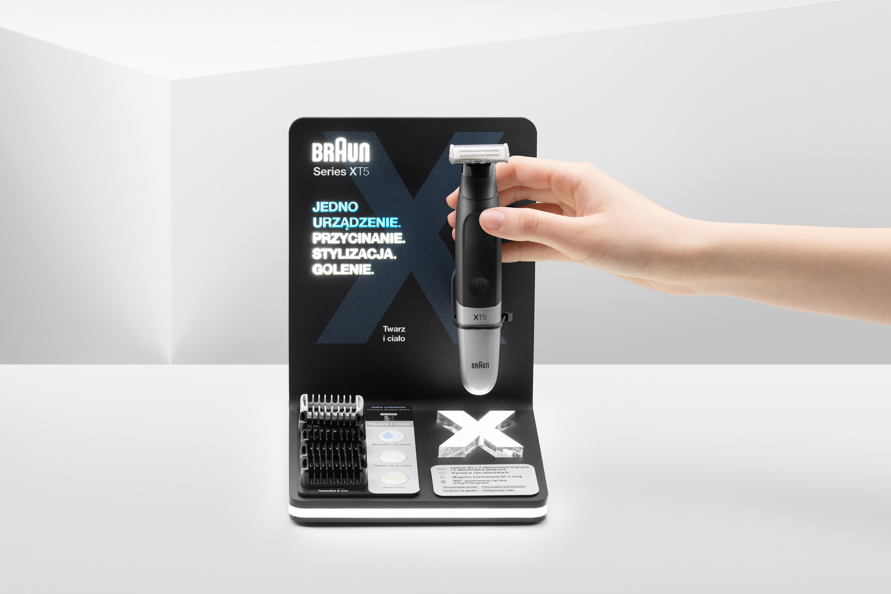
We decided to highlight an explicit massage of the brand by means of using key elements from the brand’s key visual and the product itself.
The key word that tapped into our creativity resources in the design process was “innovativeness”. Since our main objective was to transfer the branding into a 3D world, in the central part of the display we placed a transparent “X”. When illuminated, it drew the onlooker’s attention to the trimmer.
The design has a strongly limited color scheme, thanks to which the product is in harmony with the display, attracts attention, and does not go beyond the framework of how we perceive products in that category.
We look for smart solutions
We often jokingly say that this is a genuine X-Files project. In reality, the combination of consumer habits with cutting-edge trends sounded a bit bizarre. However, the end result exceeded our own expectations.
01
Attention - the utmost attention to detail
02
Clean form - UV printing directly on the material
03
Universality - a simple replacement of information content thanks to the magnetic pad
04
Presentation - despite the small area of the shelf-top display, it presents all strengths of the product along with the entire content of the product set
05
Safety - the shelf-top display is compatible with the type of anti-shoplifting safety devices used by the store
Do you like our projects?
Do you have any questions? Write to us!
contact
Countertop display for Oral-B iO
Case study
Eucerin stand
Stands
Projekt Stoiska targowego Eucerin